How do you choose one iPhone aesthetic?
Begin with one clear visual direction. A consistent Home Screen is easier to build when every later choice can be checked against the same mood, palette, and level of detail.
- Minimal: restrained color, open space, and few visible elements.
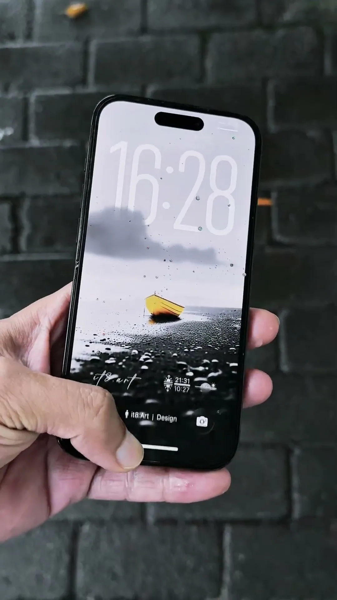
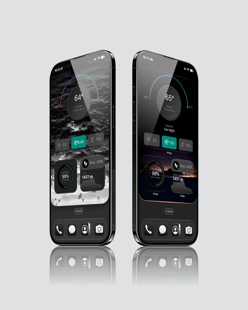
- Dark: low-key artwork with controlled highlights and readable interface text.
- Nature: landscapes, water, forests, or organic textures with matching colors.
- Colorful geometric: bold shapes and a small, repeated accent palette.
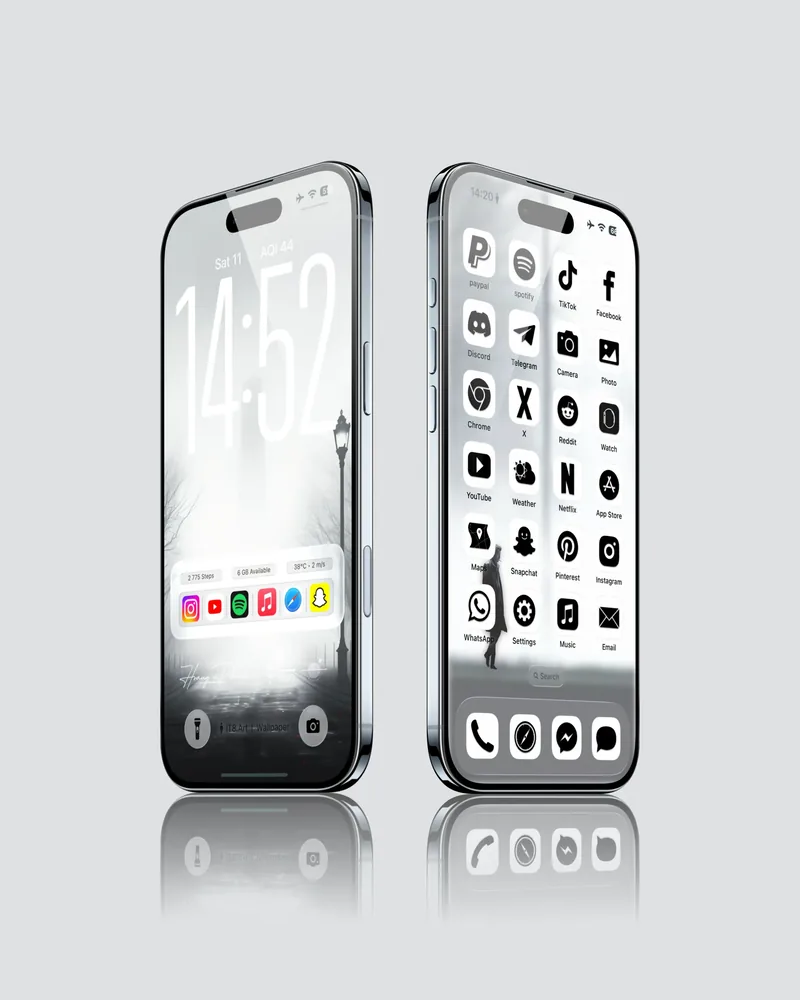
- Frosted glass: pale layers, soft transparency, and coordinated translucent-looking components.
Why should you choose the wallpaper first?
The wallpaper establishes the color, contrast, focal point, and available space for everything else. Choose it before widgets and icons so the supporting elements can be matched to the composition rather than added at random.
- Keep the main subject away from areas that will be covered by the clock, widgets, icons, or the Dock.
- Check that app labels and widget text remain readable over the image.
- Use a high-resolution portrait source and preview the crop on the actual device.
- Treat the product page as the authority for the dimensions and files included in a specific download.
How do minimal and dark Home Screen styles differ?
Minimal and dark styles can both feel calm, but they solve the composition differently. Minimal setups reduce visual information, while dark setups use controlled contrast and highlights to establish hierarchy.
| Style | Wallpaper approach | Supporting elements |
|---|---|---|
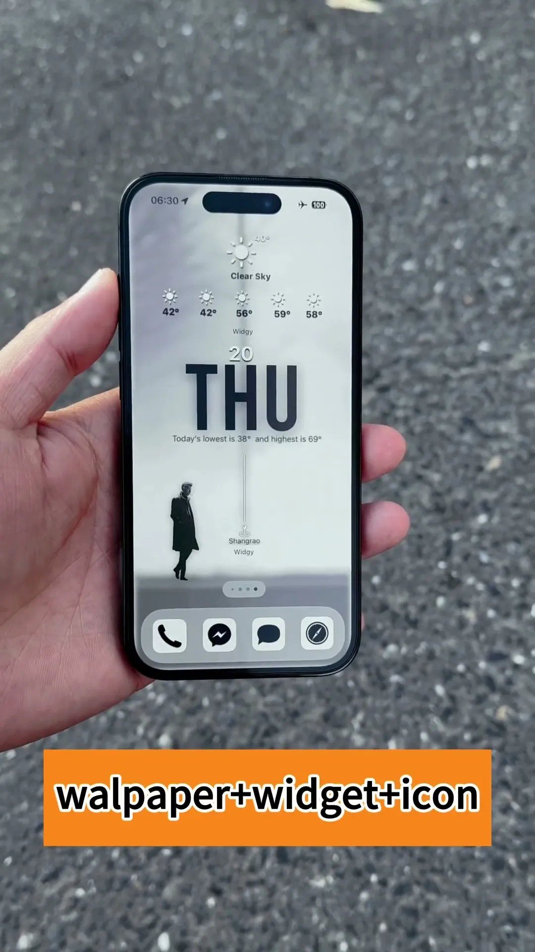
| Minimal | Open composition, restrained palette, and generous negative space. | One or two quiet widgets, a limited icon treatment, and fewer visible shortcuts. |
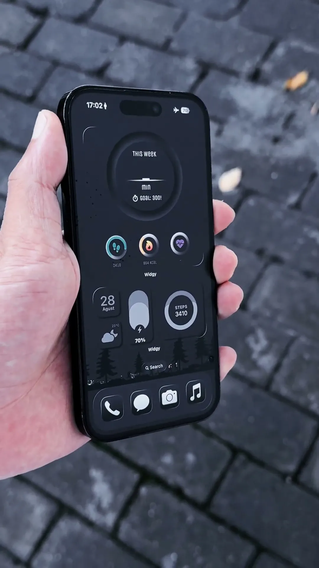
| Dark | Low-key image with a clear subject and enough contrast for time, labels, and controls. | Dark-balanced widgets and icons with a small number of brighter accents. |
| Frosted glass | Soft neutral or atmospheric background that leaves translucent-looking layers readable. | Coordinated pale widgets and icons with consistent corner shapes and spacing. |
The best choice depends on the wallpaper composition and the information you want visible. A darker image is not automatically clearer, and a minimal image still needs sufficient text contrast.
How do you choose widgets that suit the wallpaper?
Choose widgets by function first, then match their scale, color, and visual weight to the wallpaper. A small number of useful widgets usually creates a cleaner result than filling every available slot.
- Use a Large widget when it is intended to become the main Home Screen feature.
- Use Medium widgets for balanced information blocks that still leave room for apps.
- Use Small widgets for accents, compact information, or a lighter layout.
- Avoid placing detailed widgets over the wallpaper’s main subject.
- Check the product demonstration to confirm which widget sizes belong to that setup.
How do you coordinate custom app icons?
Custom app icons should repeat the wallpaper’s palette and visual language without making every app equally prominent. Use the Custom App Icon Setup Guide for the current Shortcuts workflow and the limits of shortcut-based icons.
- Start with the apps you use most instead of replacing every visible icon at once.
- Keep icon shapes, background tones, and symbol weights consistent.
- Remember that a custom Shortcuts icon opens the original app; it does not replace the app itself.
- Notification badges remain associated with the original app icon, not the custom shortcut icon.
How do you keep the Home Screen layout simple?
Use a clear hierarchy: one focal area, one supporting information area, and enough open space for the wallpaper to remain visible. This makes the setup easier to scan and less likely to feel crowded.
- Limit the first screen to the apps and information you use most.
- Align widgets and app groups to a simple grid.
- Repeat spacing rather than filling every gap.
- Move lower-priority apps to another Home Screen page or the App Library when that suits your workflow.
Should the Lock Screen and Home Screen match?
The Lock Screen and Home Screen should feel related, but they do not need to use the same image. A shared color palette, subject, texture, or contrast level is enough to create continuity while letting each screen serve a different purpose.
| Approach | Lock Screen | Home Screen |
|---|---|---|
| Same image | Use the stronger crop or subject-led composition. | Use a quieter crop with more space for apps and widgets. |
| Same palette | Choose a detailed or expressive image in the selected colors. | Choose a simpler image or gradient using the same colors. |
| Same theme | Show the primary subject, place, or motif. | Use a related texture, alternate scene, or supporting detail. |
Always preview each screen separately because iOS interface elements and cropping differ between the Lock Screen and Home Screen.
When should you use a complete iPhone setup?
Use a complete setup when you want the wallpaper, widgets, and icons to arrive with one coordinated visual direction. The Frosted Glass Aesthetic Set is the most complete option featured here: it includes 2 wallpapers, 2 widgets, 34 app icons, and setup guides, so it can support the full aesthetic setup described in this article.
If you want coordinated wallpaper and widgets while keeping your existing app icons, the iPhone Wallpaper & Widget Pack includes 6 wallpapers and 6 Widgy widgets supplied as .widgy files.
Which aesthetic iPhone Home Screen style should you try?
| Aesthetic | Visual direction | Works well with |
|---|---|---|
| Minimal black and white | Monochrome image, open space, and restrained contrast. | Simple widgets and a small set of neutral icons. |
| Frosted glass | Soft layers, pale tones, and translucent-looking surfaces. | Matching widgets and a coordinated icon set. |
| Dark | Deep tones with controlled highlights and a clear subject. | Dark-balanced widgets and selective bright accents. |
| Nature | Water, forest, coast, sky, or landscape imagery. | Weather, calendar, and time widgets using colors from the scene. |
| Colorful geometric | Bold shapes with a repeated accent palette. | Simple widgets and icons that reuse two or three key colors. |
Choose the direction that fits both the wallpaper and your daily use. A coherent setup does not require every possible customization element.
Should you choose a wallpaper pack, a wallpaper and widget pack, or a full theme?
Choose the smallest product type that contains the components you will actually use. This keeps the setup focused and makes the delivered files easier to understand.
| Product type | Best for | Typical setup scope |
|---|---|---|
| Wallpaper pack | Changing the visual background while keeping the current widgets and icons. | Lock Screen and Home Screen wallpaper files. |
| Wallpaper and widget pack | Coordinating the background with useful Home Screen information. | Wallpaper files, widget files, and product-specific setup guidance. |
| Full theme | Building one coordinated visual system across the screen. | Wallpapers, widgets, app icons, and the relevant setup guides. |
Always use the exact delivery list on the product page. The number of files, formats, widget sizes, and included guides varies by product.
How do you set up your new Home Screen?
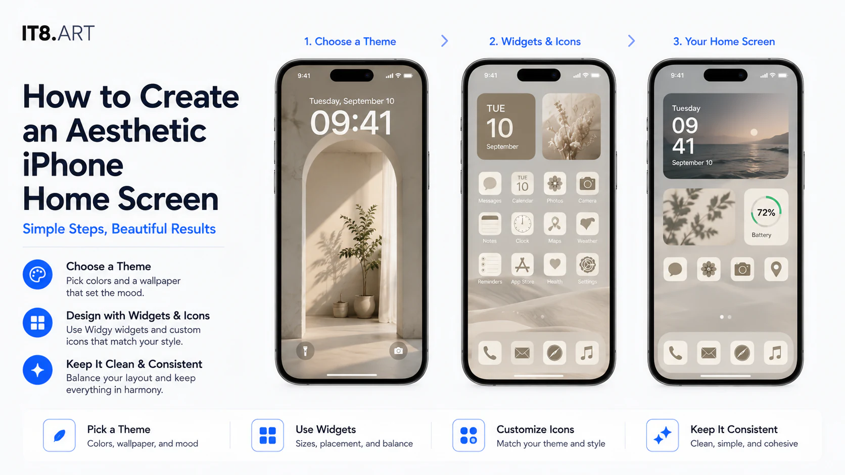
Complete the wallpaper first, then add the supporting components. Follow the Widgy Guide for .widgy files and the Custom App Icon Setup Guide for shortcut-based icons. The product ZIP also includes its product-specific setup guide.
- Download the purchased ZIP file from the order download link.
- Open the Files app, locate the ZIP, and tap it to extract the included files.
- Save the wallpaper images and any supplied PNG icon images to Photos.
- Apply and crop the Lock Screen and Home Screen wallpapers separately.
- Import the supplied .widgy files and assign the required widget sizes in Widgy.
- Create any custom app shortcuts individually through Open App and Add to Home Screen.
- Compare the finished arrangement with the product demonstration and included setup guide.
Where can you find coordinated iPhone setups?
Explore the full collection to compare wallpaper packs, wallpaper and widget packs, and complete themes. Check each product’s delivery list before purchase so the wallpapers, widget sizes, icon count, file formats, and setup guides match the Home Screen you want to build.
 4K
4K 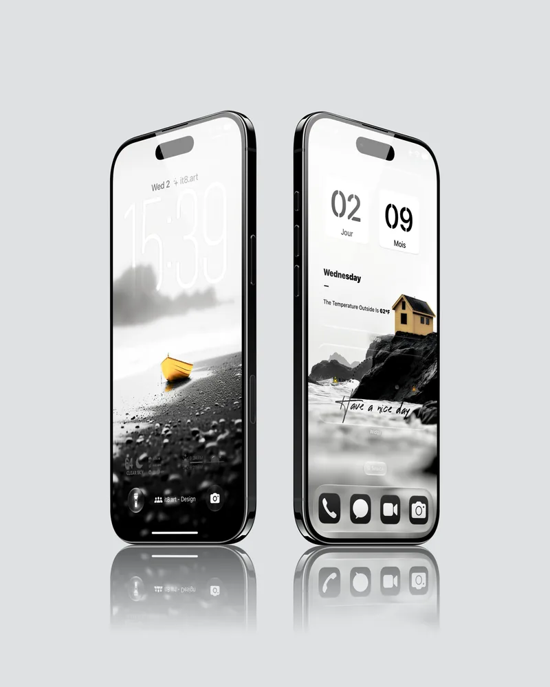 4K
4K